 1903 1903
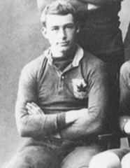
A very early Canada shirt from a tour match against Cardiff way back in 1903. |  1932 1932
The shirt Canada wore for their first ever test match against Japan in 1932. Very similar to the classic design, just with an oversized maple leaf crest.
|  1960's - 1991 1960's - 1991
The classic traditional Canada shirt. This, or something very similar to it, is what they wore for the most of the amateur era. |
 1970's 1970's
Canada did briefly experiment away from the traditional shirt in the early 1970's, with a short lived horizontally hooped Japan style shirt. |  1992 - 1993 1992 - 1993
The traditional shirt was slightly altered to include a red collar in the early 90's. This is the shirt Canada wore this shirt when they beat England in 1993. |  1993 - 1994 1993 - 1994
The first move from traditional designs. Canada wore this when they famously beat Wales away at Cardiff Arms Park, and it also carried Canada's first shirt sponsor Canada Club Whisky.
|
 1995 1995
A new logo was created in 1995 and with it a new shirt that was only briefly worn. Until 2009, this was the last shirt to follow the classic design. |  1995 - 1996 1995 - 1996
The memorable multi coloured maple leaf kit, possibly the craziest the World Cup has seen. This was dubbed "worst international kit of all time".
|  1997 - 1998 1997 - 1998
Canada switched to a vertically striped shirt in 1997, and this shirt was the beginning of black trim getting increasingly more prominent on their kits.
|
 1999 - 2002 1999 - 2002
A move further towards black ahead of white in another multi maple leaf shirt. This was what Canada wore during their last win over a Tier 1 team in 2002. |  2003 - 2010 2003 - 2010 Canada stuck with this shirt for quite some time and it survived two World Cups. It didn't bring them much luck though, this shirt coincided with the darkest period for Canadian rugby.
|  2009 2009 A retro design was revisited in 2009 for tests with Wales and the USA, which was the first time Canada played without black for a while. |
 2010 2010 Kooga took over the shirt and this red with white trim shirt and black shorts was briefly worn in the 2010 November tests in Europe. |  2011 - 2013 2011 - 2013
Black soon returned to the shirt again with a similar design to the one they wore in the dark times, but this time the shorts returned to white again. |  2014 - 2014 -
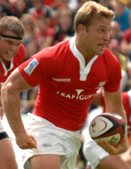
The new Under Armour shirt is almost a direct copy of the Wales shirt, with red shorts for the first time and slightly less black trim than before. |
 Following Canada's launch of a new kit partnership with Under Armour. Here is a lookback at the history of the Canucks shirts down the years.
They are worse with time sadly...
ReplyDeleteThat last kit is an horrible copy of the worst welsh kit ever!
Friendly advice to Canadians..... GET RID OF BLACK! classic kits looked way cooler. sometimes less is more. the worst 1999 - the best 1992
ReplyDelete